Work
Selected UI work
Before-and-after redesigns showing how I sharpen visual design, hierarchy, and UX. Drag the slider to see what changed.
8s → 2s
Page load time
95+
Lighthouse score
↑
Quote requests
↓
Mobile bounce rate
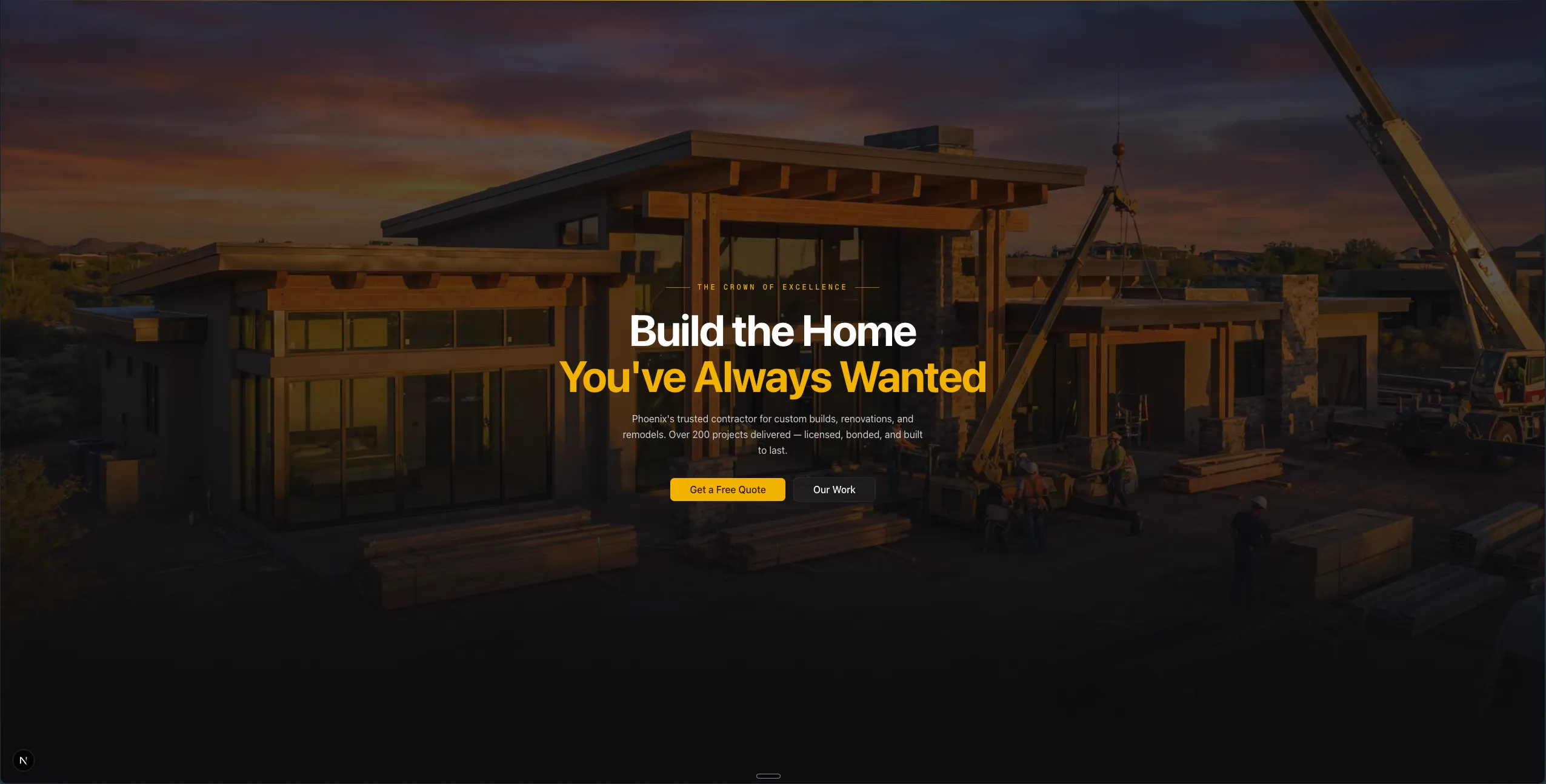
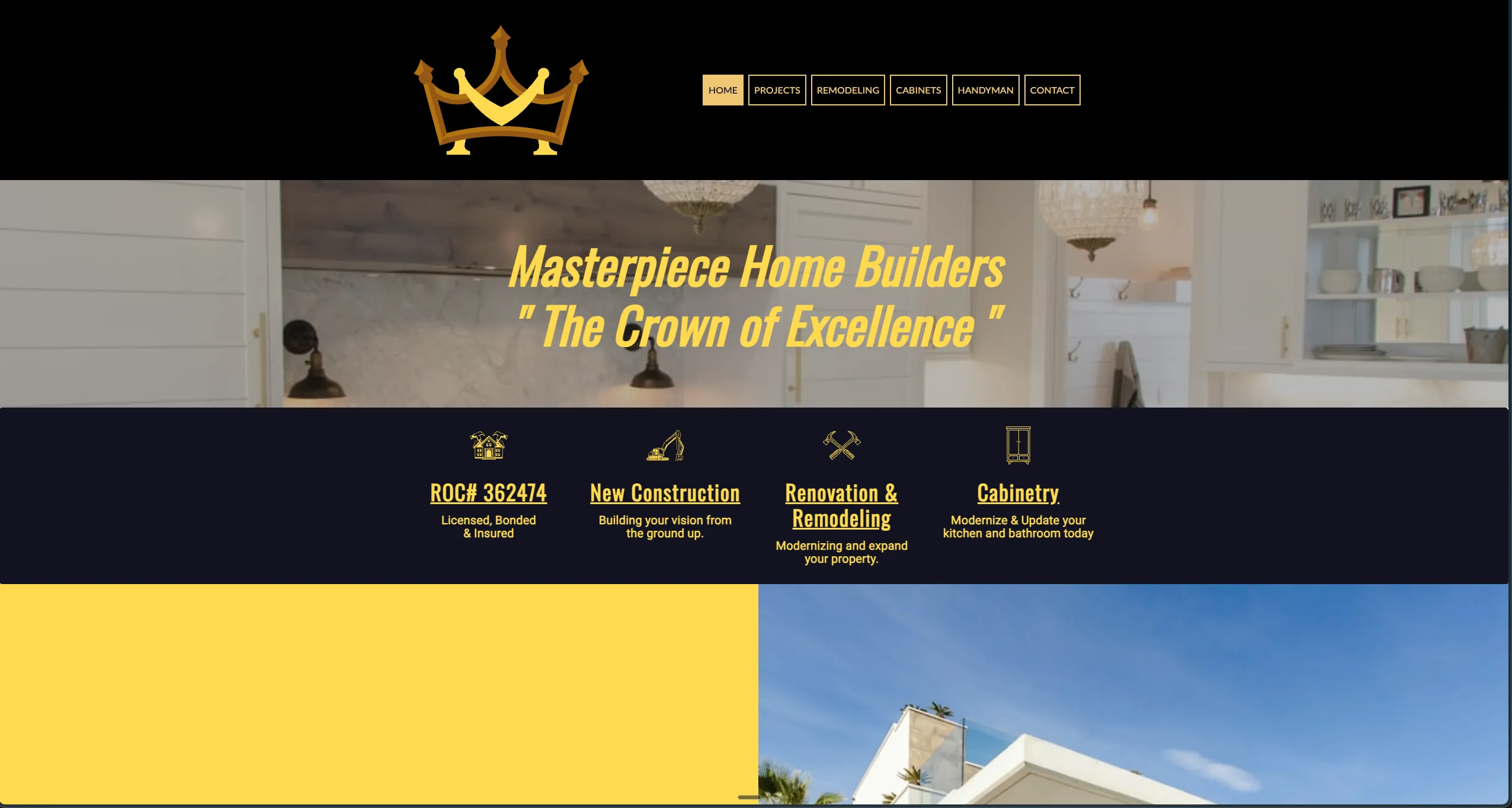
Masterpiece Home Builders
A dated black-and-gold template made a licensed Phoenix contractor look unestablished. Rebuilt with cinematic hero imagery, a tighter typographic hierarchy, and one clear path to a quote.
“Dante delivered exactly what we needed. The new site looks professional and we’re getting more quote requests than ever.”
97
Lighthouse score
↑
Time on page
↑
Above-fold engagement
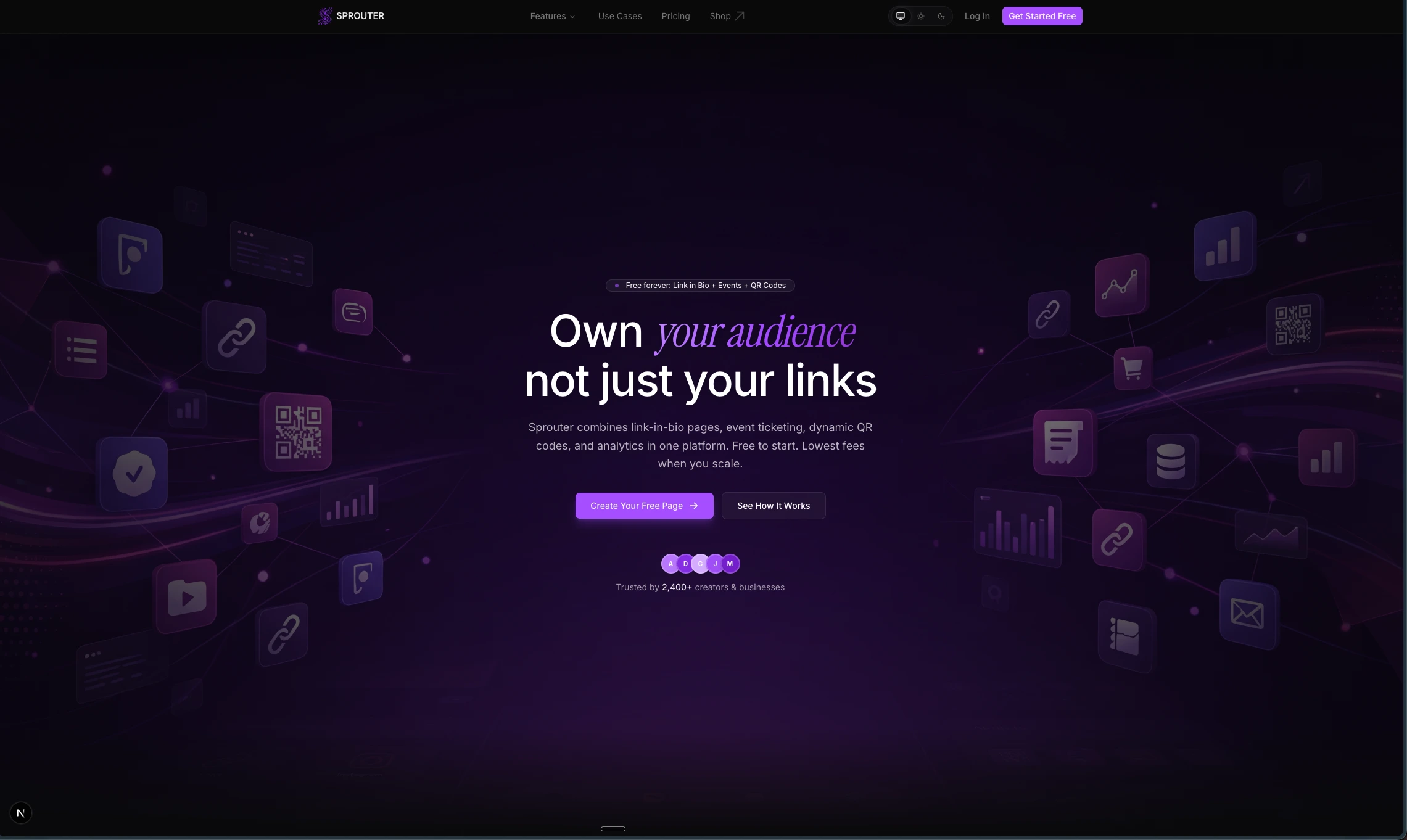
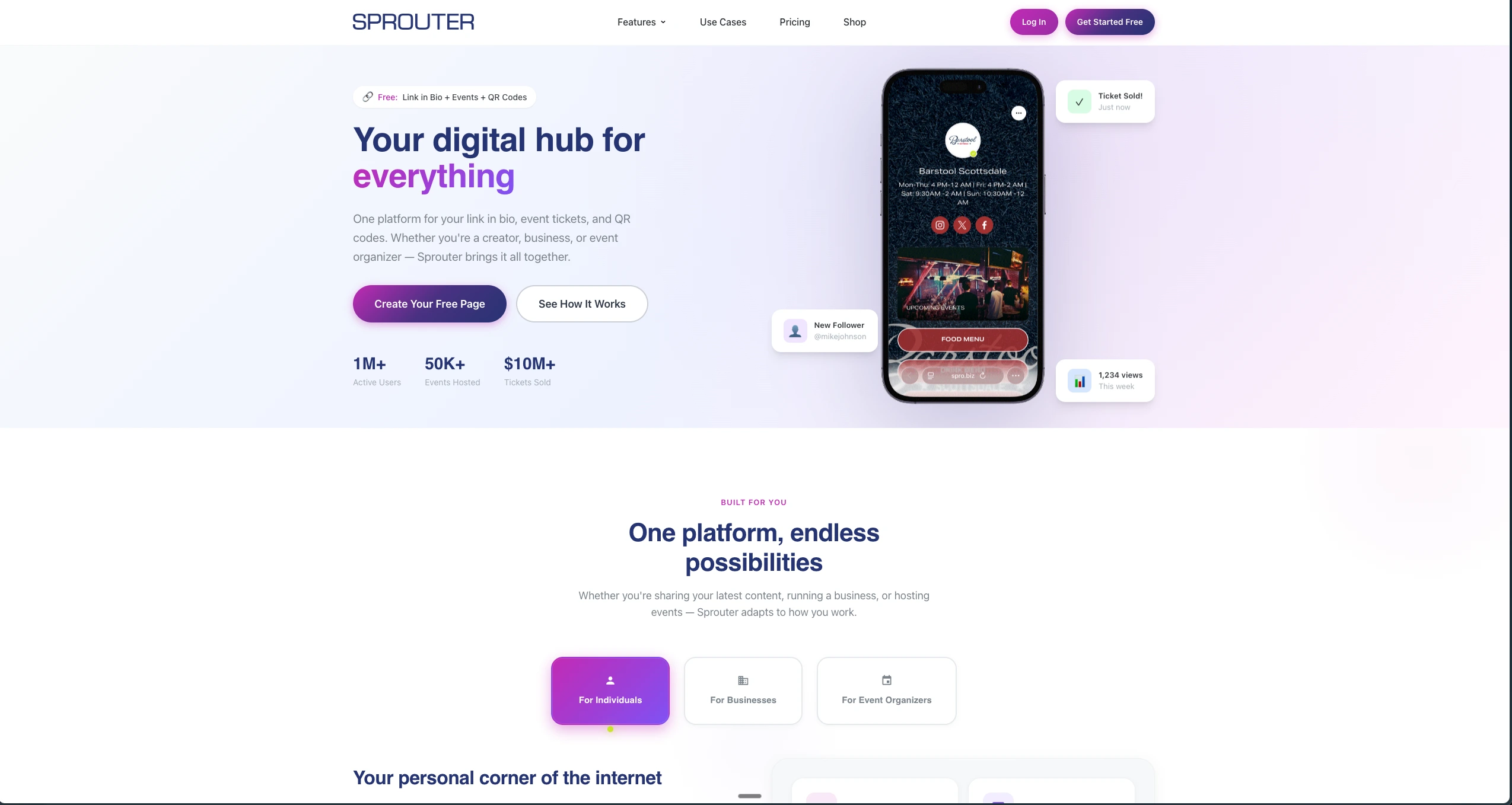
Sprouter
A generic light SaaS template made an ambitious platform feel forgettable. Rebuilt with a dark, immersive hero, floating product icons, and editorial typography that match the platform’s ambition.
“The redesign completely transformed how people perceive our product. It finally looks as good as it works.”
Pricing
Want results like these? It starts at $500.
Every project starts the same way: a focused, custom-coded build that gets you live. Add $100/month site care when you want updates, checks, and a monthly recap handled after launch.
Fresh build
$500
one-time
A custom-coded landing page or small site, live and yours.
- Custom-coded landing page or small site built around one clear action
- Responsive layout, contact form, and analytics
- Launch QA so it ships live, not just designed
Monthly care
$100
/month
Keep the site useful without becoming the website person.
- Copy, layout, and front-end edits handled for you
- Performance, SEO, and broken-link checks
- A monthly recap of what changed and what's next
Need selected-screen UI polish too? Start here anyway; I’ll quote custom scope after a quick review.